nfl
Commanders unveil nostalgic "Super Bowl era" uniforms for the 2025 season

Discussion
Just make those permanent
This is the soft launch
These will be the defaults next year or in 27/28
hoping they do this like the jets did in 2023 with their current uniforms
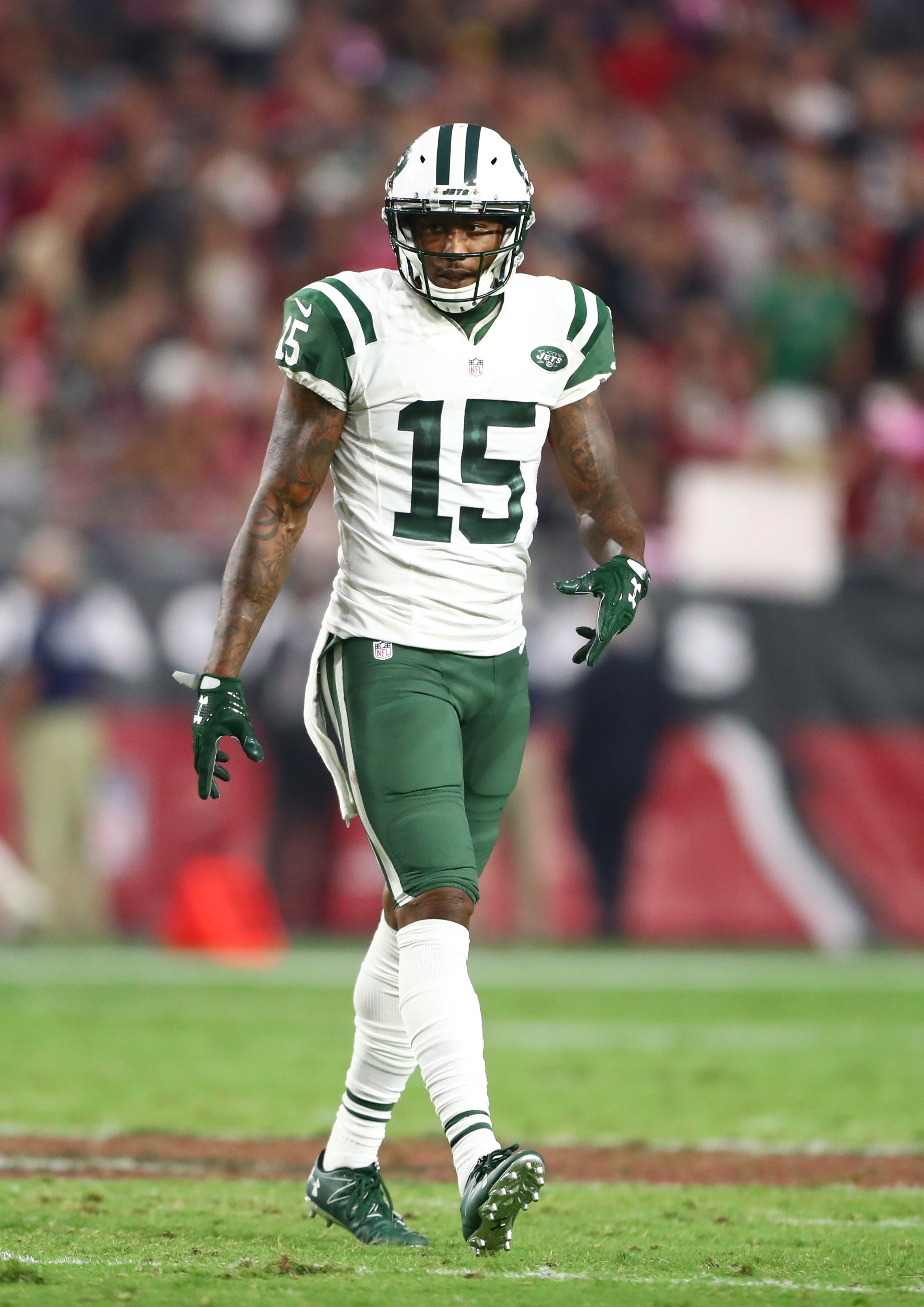
Jets should bring back the Pennington era uniforms. So much better IMO
Jets just permanently going to flip flop between Namath and Sack Exchange looks every 20 years or so going forward.
They can leave the Zack Wilson look in the trash
Eagles best uniform was the Randall era both the home and away
I may be biased due to age, but all late 80s uniforms were the best for every damn team.
Have the sack exchange logo on the Namath era duds and call it a day. The Namath era logo is too busy.
those are fire, i like their unis now too, but the big ass collar on them is off putting
In the early Nike years the collar was super wide on most teams and looked kinda like a toilet seat being worn as a necklace.
This is a normal collar. Find a new slant.
Upvoted for bringing back find a new slant
In my biased opinion, they're the best football uniform ever.
I really don’t think so. I think it’s all nostalgia with those. They’re boring as hell.
Nah I like their current ones. Sack exchange.
All they really need to do is return to Queens.
Nah. They never figured out how to do the sleeves on them without just having stripes end randomly. Back when players had real sleeves, they were sick (the OGs and the first few years they went back to them in the late 90s), but since they changed the jersey model they’ve never fit. They desperately needed an update (overall or just to the design) for like a decade before the change.
The new ones are fire, and I wouldn’t want to leave the green helmet again.
We're all hoping
There's paperwork or something they need to work out with the league
Exactly the old redskin unis were amazing until the rebrand
also add an arrow to the helmet and call it a day
Put COMMANDERS on the front and then yeah
These are too beautiful to just let it be an alternate.
Make permanent, or else we make fun of Commander fans over this!
Please become permanent. Get rid of the temu falcon uniforms
They will be in 2026. This year their limit is four games and Im guessing the fourth game will be the black
We all know what game they’re wearing the black jerseys lol
What about the the temu Steelers uni?
Those can go also, but we'll always have the hail mary play
Lowkey I like the black unis.
So much better than the white jersey that dumbass Snyder made..
I think he did it because he knew it was shit and was feeling very petty.
Can't believe the schmuck outsourced the design to Tanya. It truly is garish. The black unis have grown a little on me, but that's probably just due to the Bears game.
They're still talking about keeping the name that dumbass Snyder made anyways, so...
Snyder probably picked the worst looking uniforms out of spite when he was basically forced to do the name change.
They never should have changed away from these. Can't wait to see the burgundy ones next year
“You know those helmets we aren’t allowed to wear anymore? This as close as we can get”
I did laugh, but i am kinda digging the big W on the helmet!
Just bring back the redskins already
And another one in the "fuck you, Snyder" pile.
Is this what happens when you get a new owner? You start making good decisions and doing things right...... siiiiiiiigh
Don't worry. Once Hard Penis Penis dies and passes ownership to his son, Harder Penis Penis, it will be smooth sailing for ya'll.
Hard Penis Penis will revolutionize the NFL by not using a GM and instead making all personnel decisions using Madden, and College Football for all draft decisions.
These should be their main ones. Those Redskin jerseys were amazing and one of the best in the league.
Thank god. I hate our current uniforms so much. I do have a jersey though.
To paraphrase Quagmire. "You know what these are. We can't say it but you know."
Baltimore Colts style Ravens jerseys or GTFO.
I would be down to see that.
Would they have white helmets? Or keep the black?
White helmets if it was an alternate jersey/helmet situation brought out once or twice a year (Which is how I'd envision it).
Maybe they could come up with a psuedo-throwback logo to go with it.
Wouldn't want to see 17 games a year of white Ravens helmets, though.
Yeah I’d be down to see them play a game against an NFC team (at home) every year where they’re the colts… but purple.
And with a 60’s styled alternate logo.
I've wanted white-out Ravens unis for years so this is a 2-for-1 proposal
i would buy a lamar purple colts fauxback so fucking fast
Like with the white arm stripes but purple instead of blue? I'm hip, we should do it
Yup. Exactly! Baltimore Colts uniforms with purple instead of blue. And a different logo on the helmet.
Wouldn’t it make more sense for them to wear Paul Brown era Cleveland Browns jerseys?
That being said, a Baltimore “Colts” vs. Indianapolis Colts matchup would be funny af.
just steal the old UA maryland pride uniforms from UMD and overlay them in purple and white, easy
Would be sick but the NFL would never allow it
Why not?
It’s the design not the logos and stuff. It would be an homage.
Just look at how strict the Titans are over other teams using Oilers colors
I don’t think it would be in the same vein.
I think the idea is that you propose a Colts styled uniform, basically a copycat of what the colts wore in those days, but instead of it being blue, you do it in purple, and with a different logo to boot.
Monkey paw curls. You now get humiliated by the colts every time you play them like the Titans do with the Texans
All I see in the top image is Washington Legend Heath Shuler.
Former congressman Heath Shuler? Who knew he played football…
Please please please redskins, please stop the fucking eagles.
I love these uniforms so much. It still feels weird to see BWags in something other than Seahawks though, even if it has been a few years.
Redskins are back!
Cool. Now just change that stupid ass name to literally anything but the Commanders.
Gotta get rid of the current stock of merch first and I’d imagine they would want to have the name change the season before moving to the new stadium.
Redhawks or really almost anything with red in the name would've been better
i was always a proponent of “Pigskins” considering the Hogs nickname and all that
Right. I wasn’t the biggest fan of Redtails when that name was being circulated but I know Washington fans would now embrace Redtails with open arms lol, Redhogs as well.
Redhawks, Redtails, Redhogs, Pigskins even etc all better option than that generic crap name that they use now.
Damn the Redhawks would have been a killer name..
Seems perfect to me. But I guess the ownership prefers Commies
If they would just put the W in a yellow trimmed white circle it would be perfect.
That’s literally all that stupid fuck Dan Snyder had to do. But no. We get stuck with the atrocities that are our current uniforms. These need to be our permanent uniforms IMMEDIATELY.
I always tell people that because Synder knew he was on his way out because of all of the controversies he had surrounding him, he knew the fanbase wanted him gone as well so the whole Commanders rebrand thing (from the name, logo and misaligned uniforms) was his way of giving the fans the middle finger on his way out instead of doing a rebrand that would change the name slightly but without destroying the identity.
Redhawks would have been an excellent rebrand name & just replace the Native American face with the old spear logo and that would have been a smooth way to transition the name change, keep fans happy and keep the snowflake wokies at bay.
These look fantastic!
Those are so nice
I want to see these with the old shoulder pads.
Fire
I’ll take your word for it since tv’s back then had 2 pixels.
Please just fix the logo/name now
Love the fact that the uniforms are back to how they always should have remained and should be. Just need a Commander cannon side image or SOMETHING besides the W, or make them the Hogs already. 🤌
One of the cleanest and sharpest uniforms out there, glad they are back. Really all they needed to do in the first place was just change the name and logo and keep the uniforms the same
But then what would Snyder's wife have done with her fashion degree?
Sell shirts on Etsy for all I care lol
Fucked right off with it?
But that's not their Super Bowl era jerseys. The sleeve striping was much thicker when they went to the Super Bowl with a white cuff.
If anything, this is the McNabb Era uniform
Sleeves are not coming back to gamers in the NFL any time soon, save for random quarterbacks wanting something less like a sleeveless tee.
Only way you get that thicker sleeve striping is to put the stripes on a compression garment and force the team to wear that layer between skin and pads
E after responses: or you pull a Steelers and put the stripe on the vestige of sleeve that’s left when you tailor football jerseys like everyone is Dwight Howard:format(webp)/cdn.vox-cdn.com/uploads/chorus_image/image/15976723/167372902.0.jpg)
You could just do stripes on the sleeve and numbers on the shoulders (or helmet! [or not at all!])
I thought DEI was illegal now?
Hey I agree. Just saying, don't call it the Super Bowl era uniforms if its not the actual SB era uniforms!
Prettyyyy
hey titans, do this please?
Makes me think that they would have had much better odds surviving as "Redskins" had they deleted the wordmark on the jersey and maybe switched to the 1960's spear helmet logo...
Now change the name back to Football Team and I am a season ticket holder
It would be a baller move if a team unveiled "super bowl era" uniforms, except they were completely unchanged from current... Basically calling their shot to win this year
Everyone is changing their jerseys back to the classics. Now it's our turn! We've had the same jerseys since 2012, and honestly, these are my least favorite the Seahawks ever had. I love these new Washington jerseys, though.
They could have heated up the W sticker on the helmet or just pressed it down all the way lol, you can see the edges and it has gaps.
But I always liked the white home jerseys.
Those are nice but that logo still just ain’t it. Letter logos are often boring in general but theirs is probably the worst in all major US sports
God I loved these. Reminds me of Santana Moss
Just make this the regular uniform you idiots
These are spectacular!! Love to see this. I would love for the uniforms the team wore for their Thanksgiving 2002 game to return as an alt, too.
Why didn’t they do this to begin with?
Ketchup, mustard, and mayo are back on the menu, Boyz!
Condiment era is back!!
But the Commanders haven't won the Super Bowl?
W should be with white with gold outline. Maybe a little red outline inside the gold.
These are sooo goood.
They almost cooked. I understand the issues around using the Native American on the helmet (tbh it’s just the current ownership being completely shook of the woke mob) but instead of using that generic W logo yet again, they could have brought back the spear logo and used on that the helmet instead.
The uniforms themselves are an upgrade but I feel they still missed the train by not improving the logo on the helmet as well.
Should’ve changed the name but kept the logo in some fashion.
Now change the name again…the Washington Natives always had a good ring to it
I’ve always maintained that Commanders is a perfectly adequate name (despite what everyone else says) but the unis were absolute cheeks. This is a big W.
Honestly, people that say Commanders have the worst name when shit like the fucking Browns exist is wild.
helmet is a big w
Fucking cowards
What does this even mean
Probably unhappy with the Redskins name change.
Ah, that makes sense. Weird considering the flair.
I want to see the Steelers or Raiders as an April Fool’s Joke post their uniforms call them their new slightly darker tactical black jerseys.
"Super Bowl era" uniforms
Oh is that what they're called?
I don’t get the hype. It’s just going back to generic uniforms with generic striping and generic block numbers. Pretty much the same template basically every team also used in the past, but in different colors. Nothing special about these.
It’s more because the current white uniforms look like Arizona cardinals lite.
We’re just happy that 1, we get to see JD5 in the same colors as players like Santana Moss and 2 that the old whites are on the way out
Our current uniforms as a whole are probably the worst in the league, and the white ones are the worst of the three. They're also a holdover from the universally reviled Snyder era, and a lasting reminder of possibly the worst rebrand in sports history. This is a huge improvement.
I loathe the Commanders name, but give us back the old style jerseys and I'll be content. Replace the generic W logo with some version of the spear logo (which was the best one in our history anyway, IMO) and I'll actually be happy. I think most of the fan base is with me on this. Those of us who accepted the need for a rebrand were pretty much all hoping they'd keep as much of the look as possible while giving up the name and the controversial logo, so moving back in that direction is a win.
The clipart W logo is the worst thing about the rebrand in the first place
I suppose erasing anything that Snyder had anything to do with makes absolute perfect sense. But I like a team’s uniforms to have something distinct and identifiable about them simply beyond the color scheme. (Telling the Bills and Giants apart from each other in the ‘80s and ‘90s if you disregarded the helmets is damn near impossible.)
I’ll admit that I was annoyed that the Lions took a similar approach last year; I miss having a unique number font and I hate that the blue jerseys don’t have any team identification on them, which while “classic”, it makes it look like a knockoff jersey from a manufacturer who didn’t secure rights to use the team’s licensing decided to opt out of it altogether.
With that said, there are things I do like about the current uniforms. I’m happy they at least kept the current logo, and I love the black alternates with the blue helmets!
I think it’s fair that you just accept you have pretty bad taste in uniforms. These uniforms and other “classics” are not plain. They are simple, and they’re simple for a reason. Because it’s all you need to look like a professional football team and not a college football team’s alternate.
With that said, the Lions have really never had truly bad uniforms. Even the young Matt Stanford era uniforms with stupid numbers weren’t that bad. Sub Par? Sure. But not truly awful like the ones Washington has been wearing for 4 years. Or the ones the Rams wear, or the Texans and Falcons. If you truly believe those uniforms are better because they aren’t “plain”, deciding what’s a good or bad uniform just isn’t one of your skills.
You just want every team looking like each other, I guess.
By looking like each other you mean “not like shit”, then yes.
It’s not surprising that you have the take that you do, considering that your handle is “FollowTheLeader550”. Just look like everybody else, no matter how shitty it looks.
Bubba, the first step is admitting you have a problem. You like terrible uniforms. Take a breath, acknowledge it, and move on.
Says you? You might want to talk to yourself in the mirror instead with all that!
imagine the lions changed their uniforms to something you hated and then they just brought back the classic look after a few years. you'd be happy too
They mostly did that, especially with the blue jerseys, last year. And I’m kind of annoyed by it. I miss having a custom number font, and I hate that the blue jerseys don’t have any team identification of any kind on them, which while “classic”, makes it look like a knockoff that didn’t secure the rights to use any of the teams’ licensing. I do love the black uniforms with the blue helmets, though.
I would have an absolute meltdown if they brought Blobbles back, which was an absolute indefinite mess of a logo. Thankfully, they kept the current one.
I don’t think “classic” equals good, and nostalgia is not a design element, and shouldn’t be treated like one.
Aren’t the uniforms also from the decidedly not Super Bowl era from 1993 to 2019?
They never had a Super Bowl "era." Their championships were spread too far apart, and two of them came in strike years.
3 rings in 9 years isn't an era?
Except they wore the exact same unis for decades AFTER their last SB win. You might as well call them the Snyder era jerseys.
And when Cowboys fans talk about their Super Bowls, we're told to quit living in the past. These schmucks are going to back to their "Super Bowl era" uni's and no one bats an eye.
3 super bowl wins in 9 years definitely seems like an era to me. And no commanders fans are actively bringing up 30 year old superbowls
This is legit the only thing they had to do when they changed the name
Major Tuddy was a worthy addition
I’d let major Tuddy take Command 😩
Straight to jail
Sickest handle I've seen in a while
Before I do anything in life I ask - would Tom Hagen advise against this?
Let me tell you something, my kraut-mick friend.
Left hand up
Commanders fans when the franchise got sold:
https://youtu.be/Gb0mW3aZxLk?si=cGzO1H5eKL2R48Wc
You're not seriously suggesting they preferred Snyder?
I’m suggesting they were happy to get rid and everyone associated with him………….except Tuddy cause he’s awesome
Reevaluate the meme you used to convey that. It's not reading the way you want it to.
Love Major Tuddy
The W logo looks like ass though.
Would be better in a gold ringed, white circle I think.
Just steal the nat's w or fashion it after the R hats off the Gibbs era. Easy win.
Current logo is waste management
Or go back to the logo that was designed by a literal Native American
Go back to the redskins already
It's a taco holder
I think it’s ribbons from a plane’s wings doing a barrel roll from when they briefly considered red tails
Do this and left the helmet blank would’ve been sick
Seriously.
The Cleveland Guardians did it right.
Washington Commanders decided to make themselves look like an expansion team.
Agreed with the main point, but the Guardians have never felt like anything but the quintessential expansion team to me.
[deleted]
As a die hard Washington fan since the 1970s… fuck no to anything other than the Burgundy and Gold color scheme. And yes, I will fight you on that.
So you'll fight for ol' DC?
Exactly
You. I like you. You got moxie.
While I agree with the sentiment I think the colors are sick and look really good with all the racism removed
As a Navajo, I liked the old team name.
Hell yea brother, idk who downvoted you lol
Nah because the only real option would be red/white/blue and we really don't fucking need another one in the NFCE.